Grafana Dashboards for LoRaWAN Systems
Why Grafana for LoRaWAN
Grafana turns time-series sensor data into useful dashboards. Raw numbers in a database don't help anyone. Graphs showing temperature trends, gateway uptime, or water consumption patterns actually drive decisions.
Typical LoRaWAN Dashboard Elements
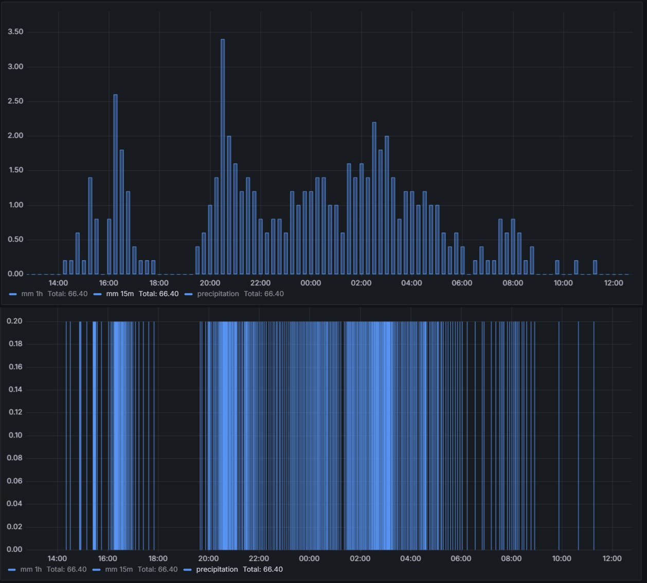
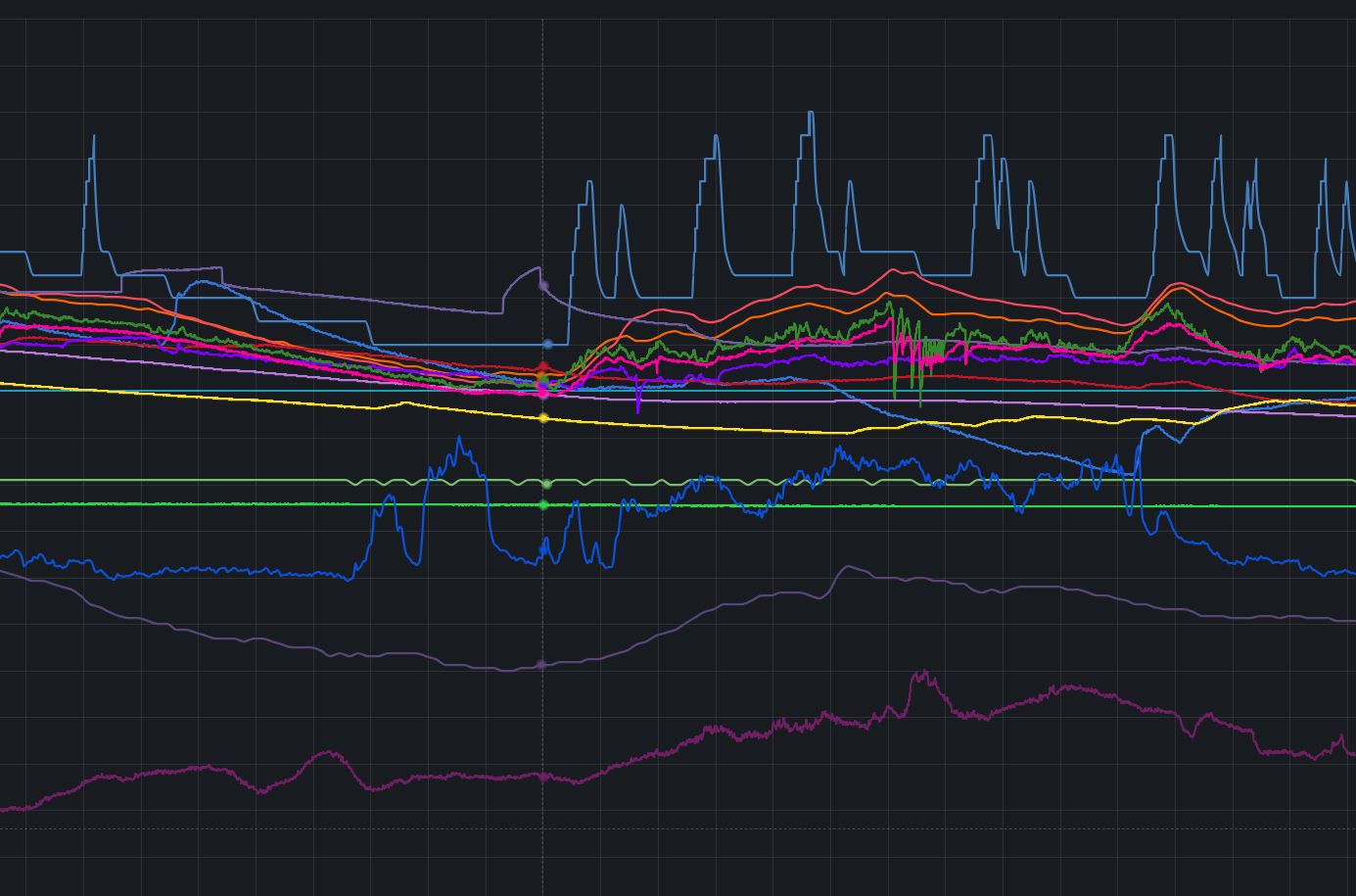
For device monitoring, track battery levels across the fleet to replace sensors before they die, watch RSSI and SNR to spot coverage problems (a weak signal means a device at the edge of range or an obstruction in the path), use last-seen timestamps to make offline devices obvious at a glance, and read packet-loss rates to tell an occasional missed transmission from a systematic failure. Back it with alerts that fire when a device goes silent or its battery drops below an operational threshold.
For gateway health, uptime percentages reveal infrastructure reliability, packet-count graphs expose traffic patterns and any gateway carrying a disproportionate load, CPU and memory metrics warn of resource exhaustion before a crash, and backhaul status confirms the internet link is stable. Plot the gateways on a map panel with status colours, green for healthy, yellow for degraded, red for offline, for an instant read on coverage.
For sensor data, display whatever the sensors measure, temperature, humidity, soil moisture, water flow, air quality, with historical trend graphs to reveal patterns over days, weeks, and seasons, current-value stat panels for an immediate reading without scrolling, and threshold markers that highlight where a reading crossed its acceptable range and warrants investigation.
Data Sources
InfluxDB is the one most LoRaWAN deployments start with: a time-series database holding timestamped readings, queried in Flux or InfluxQL, and quick across millions of data points. PostgreSQL with TimescaleDB is the alternative worth weighing against it, because it gives you relational features alongside the time-series ones, and ChirpStack already keeps its device registry in PostgreSQL, so device metadata sits one join away from the readings instead of one API call away.
Prometheus fits a different job. It suits infrastructure monitoring, gateway CPU and network server metrics, better than it suits sensor data, and it pulls rather than being pushed to. Direct API integration against ChirpStack, TTN or your own application server rounds it out, which is the sensible route for device metadata that never belonged in a time-series database to begin with.
Dashboard Design
A bad dashboard is fifty panels showing every available metric crammed onto one screen. Nobody looks at it, because finding anything relevant means scanning past everything irrelevant. More data does not mean more insight.
A good dashboard is six to eight carefully chosen panels showing what actually drives decisions. Combine related metrics, putting temperature and humidity on the same graph using dual Y-axis to reveal correlations. Display current values as stat panels for instant status, trends as line graphs for historical context. Every panel serves a purpose.
Each panel type earns its place by the question it answers. Time-series graphs show temperature, moisture, or consumption changing over hours, days, or weeks. Stat panels put a single number that needs no time context, current battery level, last packet timestamp, front and centre. Gauge panels render soil moisture as a percentage of field capacity for an intuitive glance. Tables list offline devices with last-seen timestamps to make an outage actionable. And geomap panels place gateways and devices on a map with status colours, turning coverage and geographic patterns into something you can see.
Alerting
Configure alerts with appropriate time thresholds, triggering when temperature exceeds limits for 10+ minutes rather than on single readings, which prevents false alarms from sensor glitches or brief environmental spikes. Alert when devices haven't transmitted in twice their expected interval, accounting for transmission variability while catching actual failures. Gateway offline alerts trigger immediately since infrastructure downtime affects entire sensor networks.
Deliver notifications through whatever channels your team actually monitors: email for formal documentation, Telegram or Slack for instant team notification, webhooks to custom systems for integration with ticketing or automation platforms. The alert means nothing if nobody sees it promptly.
Query Optimization
The usual symptom is a dashboard taking 30 seconds to load, because its queries pull six months of raw data and scan millions of records to render a single graph.
The fix is to stop asking for raw data. Use InfluxDB downsampling or continuous queries to pre-aggregate historical data. Store 5-minute averages for data older than a week, hourly averages for data older than a month. Limit dashboard default time range to "last 24 hours," since most operational decisions need recent data, not historical archives. Let users manually select longer ranges when analyzing trends, but don't force every dashboard load to process months of data.
One mistake accounts for most of the rest. Queries like SELECT * FROM measurements without WHERE clauses scan entire tables. Always filter by time range and device ID. Time-series databases optimize for time-based queries, so take advantage of that by specifying explicit time windows. Tag-based filtering (device_id, location) uses indexed lookups. Field-based filtering scans records sequentially, killing performance.
Variables for Multi-Site Deployments
Dashboard variables create dropdowns selecting site, gateway, or device dynamically. One dashboard template serves all locations instead of duplicating dashboards for each site, reducing maintenance burden dramatically. Users select their location of interest from the dropdown, and all panels update automatically.
Implementation uses variable syntax in queries: a $device_id variable becomes WHERE device_id = '$device_id' in the query. Grafana substitutes the selected value when executing queries. Variables work with any data source supporting parameterized queries, including InfluxDB, PostgreSQL, Prometheus, or API calls.
What I Provide
I design dashboards around what you actually need to monitor: queries optimized so panels load fast, alert rules with proper notification routing, integration with your network server's API and data pipeline, and template variables so one dashboard serves every site. Your team gets trained to customize and maintain what I build, and everything stays portable: the dashboard JSON, the query documentation, the alert configurations, and a self-hosted Grafana installation with no licensing fees or lock-in.
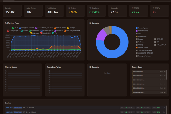
I work with whatever visualization stack you prefer. Grafana is common for LoRaWAN but not mandatory; if you're on Kibana, custom web dashboards, or other tools, I adapt to your existing infrastructure rather than forcing platform changes. The demo dashboard is one of those custom builds, a light alternative to Grafana running on live devices, if you want to see where that route ends up.
Working on a LoRaWAN project?
If this article touches on something you're building, tell me about it. The first conversation is free, and you'll get an honest read on the right approach for your situation.
Book a Free ConsultationCurious what the finished thing looks like? Open the live demo dashboard